
02 - Learning Applied Regression in Python - Part 1
Implementing Applied Regression concepts in Python Notebooks using Numpy, Pandas, Scikit-learn, and Statsmodels with Matplotlib/Seaborn plots.

Initialize Project
So before we start this little project, I want to create a GitHub repository and use Astral UV package manager to initialize a project and create a virtual environment.
I created a GitHub repo and cloned the repo into my VSCode. Now that I am in VSCode while connected to my GitHub repo, I can use bash, which is my terminal of choice, to confirm that I am the repo, and that I am in the main branch:
Now, we can initialize the project.
Before we do that though, you have to install UV, so click here for installation instructions.
Now that we have it installed, let’s enter this in the terminal:
uv initThis will create a main.py and a pyproject.toml file. Now, let’s create a virtual environment so we can install our dependencies:
uv venvSince I am on Windows, the command to activate this virtual environment would be:
source .venv/Scripts/activate
If you are using bash like me, you should see a parentheses before or on top of your current working directory in the terminal, like the image above, which tells us that the environment is activated.
Now that we activated the environment, we can install our packages. Now, there’s two commands we do from UV:
uv add <package>which adds the package as a dependency in the toml file and is designed for project management, making it easier to update packages and add version constraints, or
uv pip install <package>which is designed for compatability with traditional pip workflows. UV add is the more “modern” approach, familiar to newer package managers like Poetry and Cargo, so we will use the add.
uv add pandas numpy matplotlib seaborn scikit-learn statsmodels ipykernelNow, I will create a notebook folder and we’ll start on our first notebook which will be Simple Linear Regression with scikit-learn. You can also delete the main.py file, since we’ll only be using notebooks for this.
Now that you have created your notebook folder and created your first notebook file, let’s get started with importing the packages.
import numpy as np
import pandas as pd
import matplotlib.pyplot as plt
import seaborn as sns

# for regression modeling
from sklearn.linear_model import LinearRegression, Ridge, Lasso, ElasticNet
from sklearn.preprocessing import StandardScaler, PolynomialFeatures
from sklearn.model_selection import train_test_split, cross_val_score, GridSearchCV
from sklearn.metrics import mean_squared_error, r2_score, mean_absolute_error

# for statistical analysis
import statsmodels.api as sm
from statsmodels.formula.api import ols

# ignore warnings
from warnings import filterwarnings
filterwarnings('ignore')
Now that we have all packages in a cell and we ran it, we can go to the next step which is creating sample data. First, we will make a seed. A seed is set for generating random numbers and ensures that the sequence of random numbers remains the same across multiple runs.
Next, we will split independent variables or features, and the dependent variable or target variable.
np.random.seed(42)
X = np.random.rand(100, 1) * 10
y = 2 * X.squeeze() + 1 + np.random.randn(100) * 2
The randn(100, 1) returns a an numpy array of 100 lists with one random value from the standard distribution inside. If you want to look at the shapes of an array, you can use:
X.shape -> (100, 1)
y.shape -> (100,)
X.squeeze() takes the numpy array X converts the 2D array X with shape of (100, 1) into a 1D array with shape (100), removing the unnecessary dimension. It is being multiplied by 2, which would be the slope coefficient:
The number 1 would be the y-intercept, which is denoted as:
And np.random.randn(100) * 2 would be the error term with standard deviation of 2, which is denoted by epsilon:
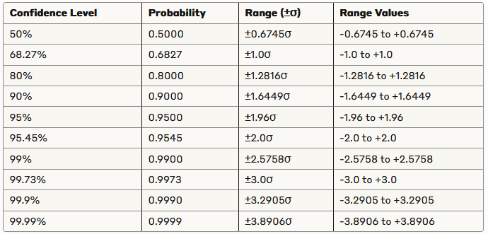
Since the standard deviation is 2, this means that about 95% of the noise values will fall between -3.92 and 3.92.
A cool table that you can use to see the confidence intervals for standard normal distribution:
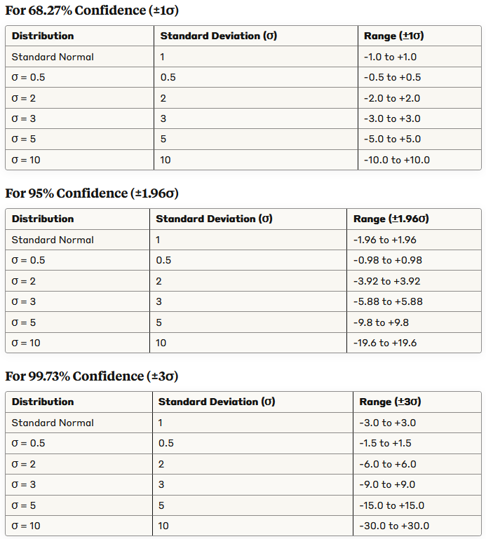
Some cool tables for various standard deviations:
Putting this equation starts the foundational steps of Applied Regression:
Next, we can split the data with scikit-learns test-train split:
X_train, X_test, y_train, y_test = train_test_split(X, y, test_size=0.3, random_state=42)The test_size parameter tells us to do a 70/30 train-test split, with 70% of the data being used for training while 30% is used for testing.
random_state is the same thing as a seed.
Next, let’s initialize our linear regression model and fit it with the training data:
model = LinearRegression()
model.fit(X_train, y_train)
Now, we can print the coefficients, which we already identified:
print(f"Intercept: {model.intercept_}")
print(f"Coefficient: {model.coef_[0]}")
Next, we can make predictions and print it out if you want:
y_pred = model.predict(X_test)Next, let’s talk about mean squared error (MSE) and R-squared. These are evaluation metrics. The sum of squared errors (SSE) is also a metric and is calculated by taking the sum of the squared residuals. A residual is the actual dependent value subtracted by the predicted dependent value:
The sum of redisuals would be denoted this way:
The estimate of the population standard deviation squared is denoted by:
This shows how to find the mean squared error. n - 2 is the degrees of freedom. The degrees of freedom are the number of values that are free to vary without violating any constraints. For regression analysis, in simple linear regression we use df = n - 2 because one df is lost for estimating the intercept, another for teh slope. For multiple regression with p predictors, we use df = n - (p + 1).
Taking the square root of mean squared error gives us the standard error of the model:
The coefficient of determination, R-squared, is a measure of how well the regression model fits the data. Another definition that it is the proportion of total variation in the dependent variable, y, that can be explained by the regression model. It is denoted like this:
SSR is the regression sum of squares, SST is the total sum of squares, and we already said what SSE was, which was the error sum of squares:
Remember, y hat is the predicted values, and y bar is the mean of the actual values. And, of course, y is the actual values.
Luckily, scikit-learn has functions that already calculate all this, so we don’t need to do it on paper:
mse      = mean_squared_error(y_test, y_pred)
r2       = r2_score(y_test, y_pred)
print(f"MSE: {mse:.4f}")
print(f"R^2 Score: {r2:.4f}")
Now, we can plot the visuals with Matplotlib:
plt.figure(figsize=(10, 6))
plt.scatter(X_test, y_test, color='blue', label='Actual')
plt.plot(X_test, y_pred, color='red', linewidth=2, label='Predicted')
plt.xlabel('X')
plt.ylabel('y')
plt.title('Linear Regression')
plt.legend()
plt.show()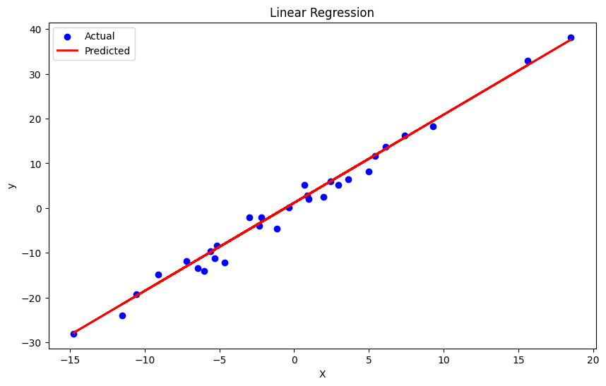
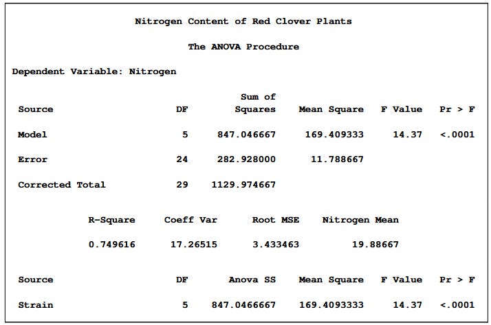
To get a SAS-like ANOVA table, here’s a template first from SAS:
We can actually use Ordinary Least Sqaures method from statsmodels library, and either print the summary or create a function to show it like SAS:
df = pd.DataFrame({"X": X.squeeze(), 'y':y})
model = ols('y ~ X', data=df).fit()
# get summary
summary = model.summary()
print(summary)
# create SAS-like ANOVA table
def create_anova_table(model):
# Get model statistics
anova_table = sm.stats.anova_lm(model, typ=1)
# Calculate additional statistics
df_total = anova_table['df'].sum()
ss_total = anova_table['sum_sq'].sum()
ms_model = anova_table['sum_sq'][0] / anova_table['df'][0]
ms_error = anova_table['sum_sq'][1] / anova_table['df'][1]
ms_total = ss_total / df_total
f_value = ms_model / ms_error
p_value = model.f_pvalue
r_squared = model.rsquared
adj_r_squared = model.rsquared_adj
# Create a more SAS-like format
sas_anova = pd.DataFrame({
'Source': ['Model', 'Error', 'Corrected Total'],
'DF': [anova_table['df'][0], anova_table['df'][1], df_total],
'Sum of Squares': [anova_table['sum_sq'][0], anova_table['sum_sq'][1], ss_total],
'Mean Square': [ms_model, ms_error, np.nan],
'F Value': [f_value, np.nan, np.nan],
'Pr > F': [p_value, np.nan, np.nan]
})
# Format the table nicely
pd.set_option('display.precision', 4)
# Create the parameter estimates table (similar to SAS)
parameter_table = pd.DataFrame({
'Parameter': ['Intercept'] + model.model.exog_names[1:],
'Estimate': model.params,
'Standard Error': model.bse,
't Value': model.tvalues,
'Pr > |t|': model.pvalues
})
return sas_anova, parameter_table, r_squared, adj_r_squared
# Generate and print the SAS-like ANOVA table
anova_table, parameter_table, r_squared, adj_r_squared = create_anova_table(model)
print("\n" + "="*80)
print(" Analysis of Variance")
print("="*80)
print(anova_table.to_string(index=False))
print("\nR-Square:", f"{r_squared:.4f}")
print("Adj R-Square:", f"{adj_r_squared:.4f}")
print("\n" + "="*80)
print(" Parameter Estimates")
print("="*80)
print(parameter_table.to_string(index=False))
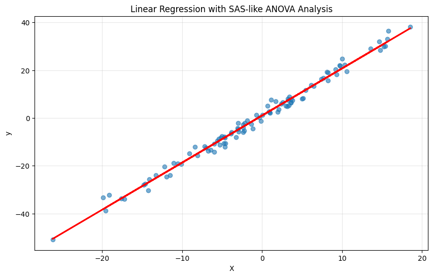
# Visualize the regression
plt.figure(figsize=(10, 6))
plt.scatter(df['X'], df['y'], alpha=0.6)
plt.plot(df['X'], model.predict(), 'r-', linewidth=2)
plt.title('Linear Regression with SAS-like ANOVA Analysis')
plt.xlabel('X')
plt.ylabel('y')
plt.grid(True, alpha=0.3)
plt.show()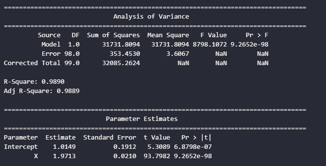
I’d much prefer the statsmodels output, but I just shared a way on how to get an SAS-like output, since I was learning SAS in my Applied Regression class.
Hoped you like this part on Applied Regression.
I’m always open to feedback and suggestions. Next part will be on Multiple Linear Regression.
Thank you for reading and stay tuned!