
04 - Learning Applied Regression in Python - Part 3
Identifying and Handling Influential Observations

Welcome back to the Applied Regression series. We covered linear and multiple regression in the two previous parts.
This part will cover identifying and handling outliers. Check out the GitHub for this series!
What are influential observations?
Influential observations are data points that have an impact on your regression model. Three types of unusual observations are:
Outliers: Observations with unusual Y values.
High-leverage points: Observations with unusual X values.
Influential points: Observations that significantly affect regression coefficients.
Understanding these distinctions is crucial because not all outliers are influential, and not all influential points look like outliers at first glance.
Detecting Influential Observations
Let’s import our libraries first:
import numpy as np
import pandas as pd
import matplotlib.pyplot as plt
import seaborn as sns
from scipy import stats
import statsmodels.api as sm
from statsmodels.graphics.regressionplots import influence_plot
Then, let’s set a seed:
np.random.seed(42)Next, let’s generate some data and create a linear relationship with some noise, this time using Gaussian distribution:
# generate random data
n = 100
X = np.random.normal(0, 1, n)

# create a linear relationship with some noise
y = 2 + 3 * X + np.random.normal(0, 1, n)
So, now we have two arrays. Let’s use those arrays and turn this data into a pandas DataFrame:
df = pd.DataFrame({
    'X': X,
    'y': y
})
Let’s plot it to see what the relationship looks like:
plt.figure(figsize=(10, 6))
plt.scatter(df['X'], df['y'])
plt.title("Scatter Plot of Data with Influential Point")
plt.xlabel("X")
plt.ylabel("y")
plt.show()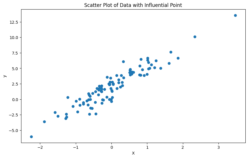
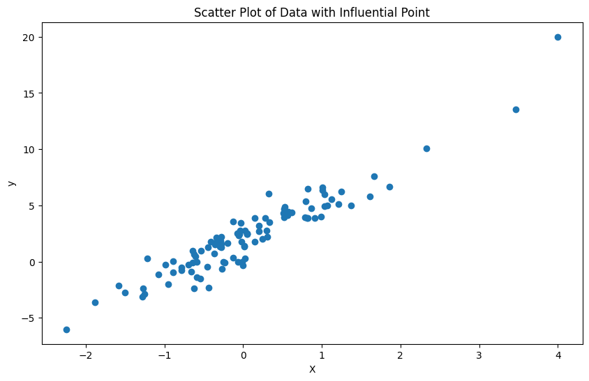
Now, since we are talking about influential observations, let’s add one influential point at the last index, which would be the 100th index (because we have 100 samples and indices start from 0, so our last index of the 100 samples is 99):
df.loc[100] = [4, 20] # high leverage and outliersAnd then let’s plot it to see the new observation. The y ticks change in range after this addition:
Let’s make our model now with statsmodels library and add a constant to the model:
X_const_const = sm.add_constant(df['X'])Then, we fit the model and print the results of the model:
model = sm.OLS(df['y'], X_with_const).fit()
print(model.summary())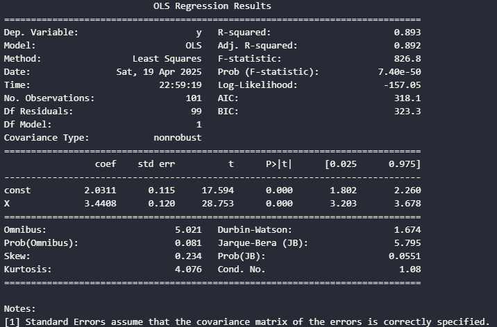
Now, let’s do some residual analysis. First, we have to get the residuals:
df['residuals'] = model.resid
df['abs_residuals'] = np.abs(model.resid)
And let’s plot a residual plot:
plt.figure(figsize=(10, 6))
plt.scatter(df["X"], df['residuals'])
plt.axhline(y=0, color='r', linestyle='-')
plt.title('Residual Plot')
plt.xlabel('X')
plt.ylabel('Residuals')
plt.show()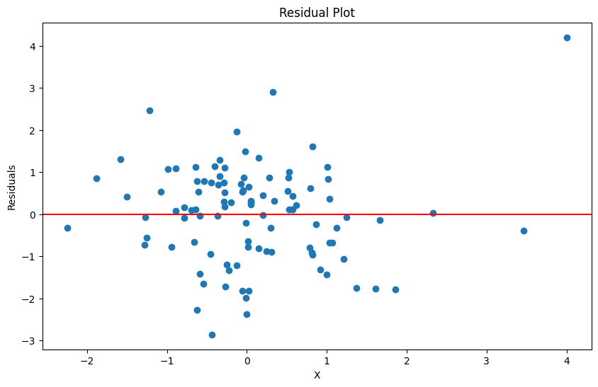
So, this plot looks pretty nice for the most part. There is not a pattern and there looks like constant variance for most of the points, so it doesn’t really look like the assumptions are violated right now.
Let’s actually identify potential outliers, which is when a residual point is greater than 2 standard deviations:
residual_threshold = 2 * df['residuals'].std()
potential_outliers = df[df['abs_residuals'] > residual_threshold]
print(f"Potential outliers based on residuals (> {residual_threshold:.2f})")
print(potential_outliers)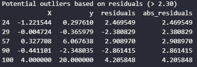
Next, leverage measures how far an observation is from the mean of the independent variables. Let’s calculate leverage and plot the leverage values:
df['leverage'] = model.get_influence().hat_matrix_diag

plt.figure(figsize=(10, 6))
plt.stem(df.index, df['leverage'])
plt.title('Leverage of Observatons')
plt.xlabel('Observation Index')
plt.ylabel('Leverage')
plt.show()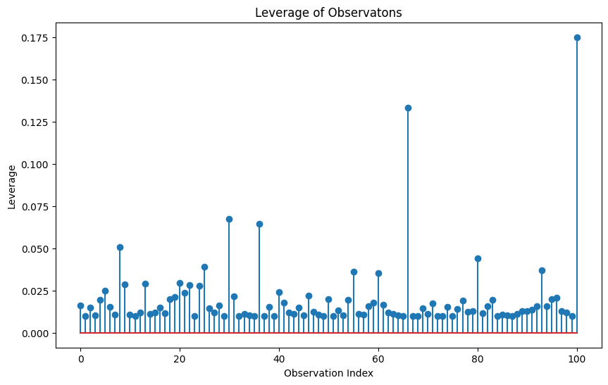
Anything with a spike should be observed further as a potential outlier. Now let’s identify high leverage points. The rule of thumb is that high leverage points is when the leverage value is greater than this equation:
P is the number of predictors and n is the sample size. Let’s identify these high leverage points with code:
p = X_with_const.shape[1] - 1 # number of predictions (excluding constant)
leverage_threshold = 2 * (p + 1) / len(df)
high_leverage = df[df['leverage'] > leverage_threshold]

print(f"High leverage points (leverage > {leverage_threshold:.4f}):")
print(high_leverage)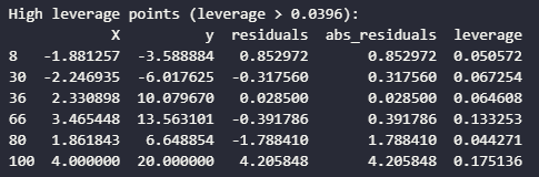
Next, we can use Cook’s Distance which combines information about residuals and leverage to measure the overall influence of each observation:
influence = model.get_influence()
cook = influence.cooks_distance[0]
df['cooks_d'] = cook

plt.figure(figsize=(10, 6))
plt.stem(df.index, df['cooks_d'])
plt.title("Cook's Distance")
plt.xlabel("Observation Index")
plt.ylabel("Cook's Distance")
plt.show()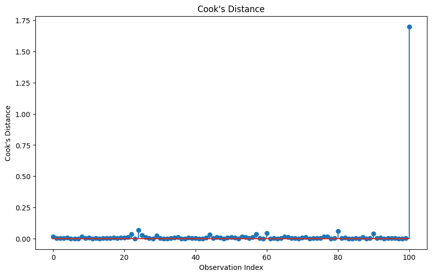
Now, we can identify influential points where the rule of thumb is Cook's D statistic greater than 4/n.
cooks_threshold = 4 / len(df)
influential_points = df[df['cooks_d'] > cooks_threshold]

print(f"Influential points (Cook's D > {cooks_threshold:.4f})")
print(influential_points)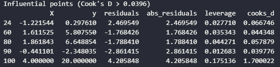
Next, we can use something called DFITS and DFBETAS for detailed information about how each observation affects the model:
df["dfits"] = influence.dffits[0]

dfbetas = influence.dfbetas
df['dfbetas_const'] = dfbetas[:, 0]
df['dfbetas_X'] = dfbetas[:, 1]

plt.figure(figsize=(10, 6))
plt.stem(df.index, np.abs(df['dfits']))
plt.title('DFITS')
plt.xlabel('Observation Index')
plt.ylabel('|DFITS|')
plt.show()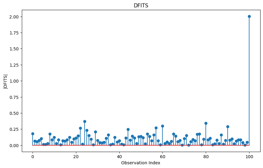
Then, we can identify influential points based on DFITS. The general rule of thumb is:
dfits_threshold = 2 * np.sqrt((p + 1) / len(df))
dfits_influential = df[np.abs(df["dfits"]) > dfits_threshold]

print(f"Influential points based on DFITS (|DFITS| > {dfits_threshold:.4f}):")
print(dfits_influential)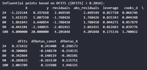
Now, we can get to a cool graph called the influence plot, which is the studentized residuals vs leverage. The difference between standardized residuals and studentized residuals is that:
Standardized residuals are calculated by dividing each raw residual by the estimated standard deviation of the residuals.
Studentized residuals are calculated by dividing each residual by its estimated standard error, which varies for each observation based on its leverage.
The key difference is that studentized residuals account for the fact that observations with high leverage, unusual X values, naturally have smaller residuals even when they’re influential. This makes studentized more reliable for detecting outliers across the entire dataset:
fig, ax = plt.subplots(figsize=(12, 8))
influence_plot(model, ax=ax)
plt.title("Influence Plot: Studentized Residuals vs. Leverage")
plt.tight_layout()
plt.show()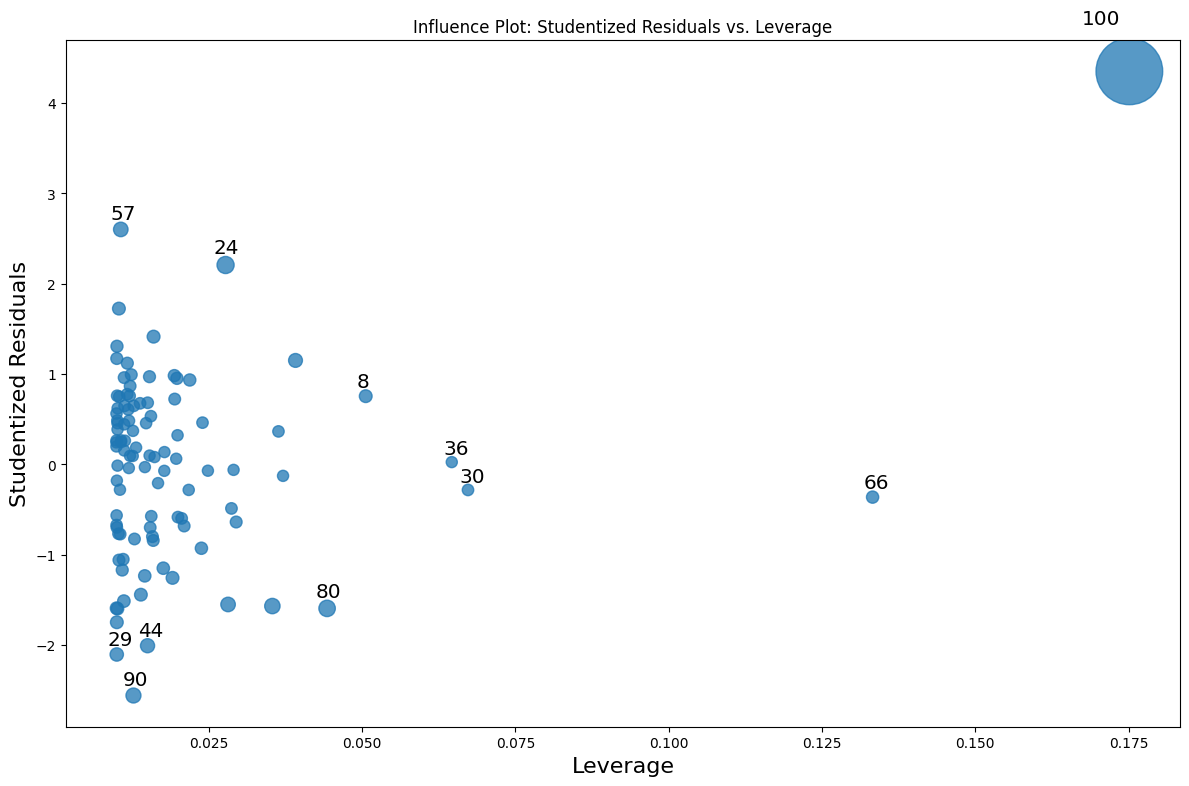
We can see the the observation we added is definitely an influential point that needs to be dealt with.
Handling Influential Observations
Let’s fit the model without the influential point and compare the models:
clean_df = df[df.index != 100]
X_clean = sm.add_constant(clean_df["X"])
clean_model = sm.OLS(clean_df['y'], X_clean).fit()

print("Original Model:")
print(f"Intercept: {model.params[0]:.4f}, Slope: {model.params[1]:.4f}, R-squared {model.rsquared:.4f}")

print("\nModel without influential point:")
print(f"Intercept: {clean_model.params[0]:.4f}, Slope: {clean_model.params[1]:.4f}. R-squared {clean_model.rsquared:.4f}")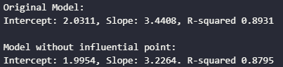
Now, don’t get fooled by the higher R-squared of the model with an influential point. The model was artificially inflated by the influential observation. Influential points can stretch the variance. When R-squared measures explained variance, then of course it will increase increase the total variance in both X and y variables.
The regression line also follows influential points. Because of their leverage and distance from the center of the data, influential points can pull the regression line toward themselves like a black hole.
Let’s compare the models with a comparison plot:
# Plot comparison
plt.figure(figsize=(12, 8))

# plot original data
plt.scatter(df['X'], df['y'], alpha=0.7, label='All Data')

# highlight influential point
plt.scatter(df.loc[100, 'X'], df.loc[100, 'y'], color='red', s=100, label="Influential Point", edgecolor='black')

# plot original regression line
x_range = np.linspace(df['X'].min(), df['X'].max(), 100)
plt.plot(x_range, model.params[0] + model.params[1] * x_range, 'b-', label=f'Original Model: y = {model.params[0]:.2f} + {model.params[1]:.2f}X')

# plot clean regression line
plt.plot(x_range, clean_model.params[0] + clean_model.params[1] * x_range, 'g--', label=f'Clean Model: y = {clean_model.params[0]:.2f} + {clean_model.params[1]:.2f}X')

plt.title("Comparison of Regression Models")
plt.xlabel('X')
plt.ylabel('y')
plt.legend()
plt.show()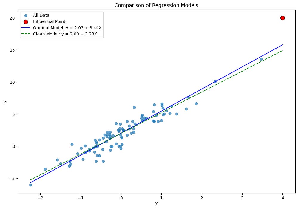
It’s not a massive difference, but that’s because we did it with only one added influential point. Although, influential points are quite small in real datasets, typically around 1-5% of total observations.
But the key takeaways from handling influential plots:
Verify data accuracy: Check if the observation is a recording error
Understand the context: Sometimes influential points represent important phenomena
Robust regression: Use regression methods less sensitive to outliers, scikit-learn has different regression models that handle outliers
Transformation: Apply transformations to reduce the influence of extreme values
Remove with caution: Only remove if you have valid reasons and report both analyses
Next post, let’s dive deeper into some hypothesis tests and confidence intervals, this time using a real dataset.