
Using Altair for PCA Graphing
How to stack Altair charts in correct Z-order like a puzzle.

I tried the library called Altair and I really like it.
I can plot interactive charts easily, but building some PCA lines was a little bit complicated.
You can use hex values for colors, and add a “tooltip”, which is basically a legend.
So this code right here is to create a PCA chart with points and two principal components:
def create_pca_chart(df: pl.DataFrame):
    line_segments = []
    for i, (comp, var_ratio) in enumerate(zip(pca.components_, pca.explained_variance_ratio_)):
        scale_factor = 3.5
        x_end = comp[0] * scale_factor
        y_end = comp[1] * scale_factor

        line_segments.append({
            ‘component’: f’PC{i+1}’,
            ‘x’: [0, x_end],
            ‘y’: [0, y_end],
            ‘variance’: f’{var_ratio*100:.1f}%’,
            ‘index’: i
        })
    points = alt.Chart(df).mark_circle(size=80, opacity=0.45, color=”olivedrab”).encode(
        x=alt.X(’PC1:Q’, scale=alt.Scale(domain=[-4, 4]), title=’PC1’),
        y=alt.Y(’PC2:Q’, scale=alt.Scale(domain=[-4, 4]), title=’PC2’)
    )

    lines_list = []
    for seg in line_segments:
        seg_df = pl.DataFrame({
            ‘x’: seg[’x’],
            ‘y’: seg[’y’],
            ‘component’: [seg[’component’]] * 2,
            ‘variance’: [seg[’variance’]] * 2
        }, strict=False)
        line_chart = alt.Chart(seg_df).mark_line(size=3).encode(
            x=’x:Q’,
            y=’y:Q’,
            color=alt.value([’#e41a1c’, ‘#377eb8’][seg[’index’]]),
            tooltip=[’component:N’, ‘variance:N’]
        )
        lines_list.append(line_chart)

    arrow_points = []
    for seg in line_segments:
        arrow_points.append({
            ‘x’: seg[’x’][1],
            ‘y’: seg[’y’][1],
            ‘component’: seg[’component’],
            ‘variance’: seg[’variance’]
        })

    arrow_df = pl.DataFrame(arrow_points)
    arrows = alt.Chart(arrow_df).mark_point(
        size=150,
        shape=’triangle-up’,
        opacity=0.8
    ).encode(
        x=’x:Q’,
        y=’y:Q’,
        color=alt.Color(’component:N’, scale=alt.Scale(domain=[’PC1’, ‘PC2’], range=[’#e41a1c’, ‘#377eb8’])),
        tooltip=[’component:N’, ‘variance:N’]
    )

    chart = (points + lines_list[0] + lines_list[1] + arrows).properties(
        width=600,
        height=600,
        title=’PCA of 2 Components’
    ).interactive()

    return chart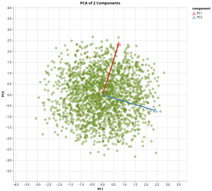
You can just make multiple charts like we did in our example:
Made a plot for all the points using our PCA DataFrame, which stores the scores for both principal components of the new data points.
Next, we make line segments from the origin to the first two loadings of each on each principal component., and store that data into a Polars DataFrame, and use this DataFrame to make a line chart, where we use those segments as variables for the line chart.
Next, we make some arrow points, because it’s a vector, and vectors have magnitude and direction. We use the end points for the X and Y points.
Finally, we combine all the charts together with just addition and make it interactive. Note that the order you put these charts change the Z-Order, so the order does matter. Now, these are just triangles that don’t really point to the direction, but I’m using it as a place holder because I haven’t found a way to create arrows yet.